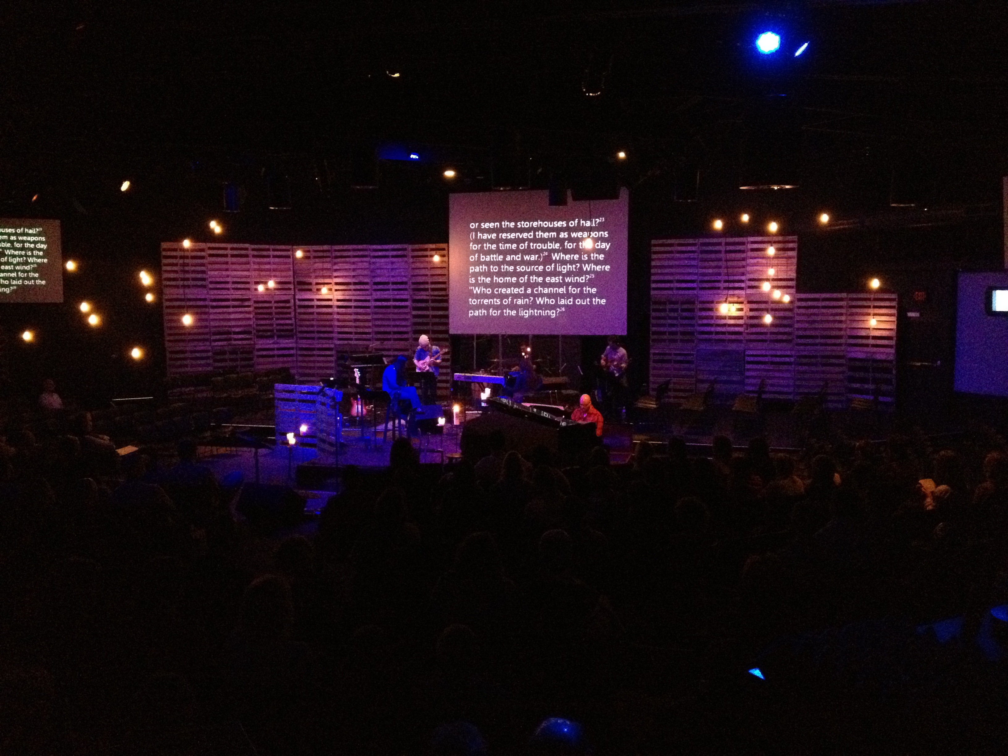
I’m often asked how we put together everything that goes into our teaching series at Westwinds—the art, aesthetics, interactives, responses, reflection, and biblical research.
Let me tell you.
We start with what we perceive God is saying to us. Sometimes we feel like God is telling us our people are biblically illiterate; sometimes we feel like he’s motivating us toward charity; sometimes we feel like he’s leading us to explore a new aspect of faith. And so on. It’s usually one of these three things: a biblical, virtuous, or topical prompting that we discern through prayer, study, and conversation.
Once we discern God’s prompting, we start thinking about how we might approach the issue, whatever it is. We have the big idea, and now we need to find a “way in.” This process includes branding, art, screens, ads, etc. For example, when we spent eight months teaching through the gospel of Mark, we needed to find an access point for people to engage in the teaching. We needed a way for people to gain a sense of scope and a sequence they could follow in order to get their arms around the whole thing. In this instance, the way in was six diagrams that explained the major themes, printed on coasters.
Conversely, when we taught about hamartiology—the theology of sin—we needed a way in that made the topic less intimidating, so we came up with the idea of Furious George, the sin monkey. We also provided an accompanying children’s book following Furious George through a variety of circumstances that illustrated the right and wrong ways to deal with sin.
To summarize: step one is discerning the big picture. Step two is finding the way in—the branding, the art, the gimmick, if you will.
fossores
Related posts
Categories
Category Cloud
Tag Cloud
Recent Posts
- Victors and Victims November 6, 2018
- 3 Hacks for Happiness October 29, 2018
- Hope Against Death September 20, 2018
- The Shape Of The Cross September 19, 2018


